


New Logo…New website…New LAUNCH!
August 28, 2008 Ed
Yes, finally after years (and I mean YEARS) of nagging, Ed has (with a little help from his new padawan Matt) updated the website!
Now you will be able to view our films, photos, blogs and features with just a few clicks. What more, is now YOU can get involved too! bypuk.com is all about the amateur filmmaking and fanfilm community! So if you want to comment, login or simply look at how we made our films, this is the place!
There is still some work to do, but Ed and Matt are working flat out, well not quite flat out, more like working hard, well not that hard, Ed and Matt said they might do a bit more to the site soon. Well actually Darren the Executive Bully told them to do some more soon.
Anyway, keep coming back or better still subscribe to our mailing list or click on the RSS feed on the top right of our home page and we will tell you when the site has been updated!
Enjoy the site!
Comments
4 Responses to “New Logo…New website…New LAUNCH!”
Feel free to leave a comment...
and oh, if you want a pic to show with your comment, go get a gravatar!
Well done Ed for updating website and on your birthday too. Happy Birthday!
Hey Ed and Matt – Good job!
Ed, nice new logo! Why did you change it and why have you used teeth and skulls?
OK… now that’s not a leading question at all, is it?
Well… the original BYP logo was heavily influenced by the logo and content of our first full length film – Geriatric Park. This was about a group of rampaging geriatrics who had been cloned from the mucus on a set of fossilised dentures. One scene in the film finds the group of geriatrics wandering around a field at sunset, and this was used as inspiration for the logo, along with a little nudge from the Jurassic Park logo (of which the film was a parody).
The original BYP logo served its purpose well. However, although I had updated and repolished it a number of years ago, it was still very complicated, with a sunset, silhouette of a geriatric skeleton and some foliage, a filmstrip and the Backyard Productions type. All too much…
I had been hoping to update / redesign the logo for some time, and until now, had met strong resistance from other BYP members when it came to moving completely away from these themes. A number of suggestions and designs have been rejected by me as a result.
Whilst redeveloping the site and playing around with options for the header and ways to simplify the identity, I decided I had to separate out the elements; the type and graphic elements might not always be needed together. I removed some references to Geriatric Park, but retained a toothless ‘geriatric’ skull and the warmth of the original colour scheme. The dentures came as a flash of inspiration at just the right moment, and I seized the opportunity to add these to the identity. Not only do they refer directly back to Geriatric Park, but I think they have a recognised comedic value in their own right, which reflects the fun and playful nature of all our productions. One could imagine they had been fired across the room by the guffawing geriatric skull! Even the skull itself harks towards a little Shakespearian thespianism and drama, (BYP projects often involve a lot of thespians).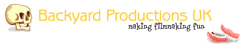
Watch this space, though. I intended the new identity to be adaptable, and we may well see the addition of other ‘props’ in the future. As our company moves forward with this new site, community and exciting upcoming projects, I hope the new identity can support and reflect this evolutionary process.
Your webmaster and lead designer, Ed
WOW!
Thanks for that Eds!!!!!